polio

polio

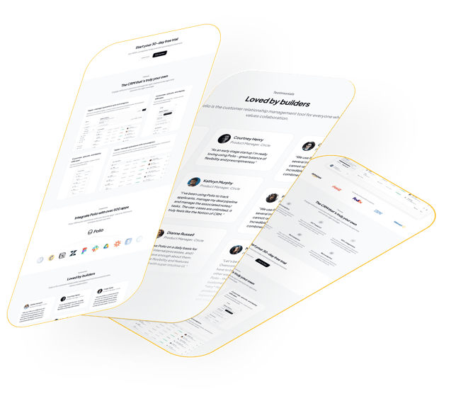
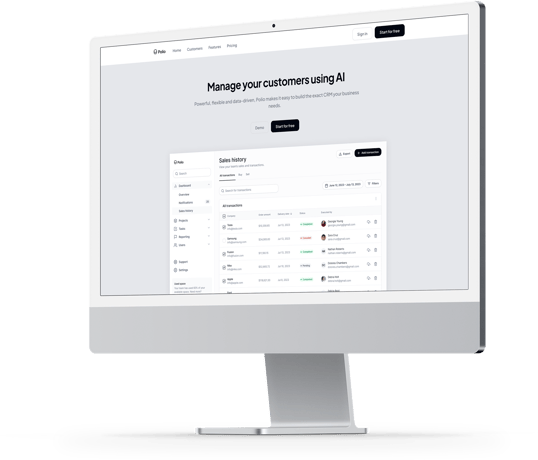
Polio, a cutting-edge CRM software company, is seeking a modern single-page landing page

design for its CRM product. The landing page aims to captivate potential customers, effectively communicate the key features and benefits of Polio's CRM solution, and ultimately drive conversions

Project overview

UX/UI Design

My Role

This project focused on redesigning Polio’s AI-driven CRM platform to create a user-friendly interface that balances powerful features with intuitive navigation. By conducting user research, wireframing, and prototyping, I developed a scalable platform that simplifies complex data visualization and ensures robust security for customer information. The result is a seamless, engaging experience that empowers users to manage customer relationships effectively with the help of AI technology.

As a beginner UX designer, I was excited to take on the challenge of designing Polio CRM’s landing page, aiming to create a visually stunning and user-friendly experience. I focused on learning and applying UX principles to bring out the professionalism and innovation of Polio's CRM product. My goal was to design a page that not only looked engaging but was easy for users to navigate and connect with.

I started by researching competitor sites and gathering ideas to understand how other brands communicate their CRM solutions. This helped me see what features and benefits potential users might value, so I mapped out Polio CRM’s unique features—like enhanced customer insights and seamless data management—to make sure our landing page highlighted what makes Polio CRM stand out.

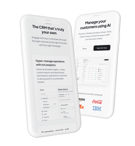
With a clear goal in mind, I focused on capturing the target audience’s attention. I designed a clean hero section with a clear call-to-action button to encourage visitors to explore the product more deeply, sign up for a free trial, or request a demo. I also created space for feature highlights and testimonials to build trust and convey the CRM's value in a compelling way.

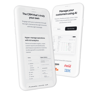
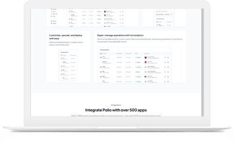
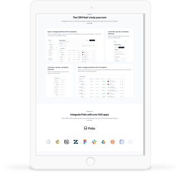
Ensuring the design worked smoothly across different devices was an essential step in my process. I tested each layout on mobile, tablet, and desktop views, adjusting the navigation and layout as needed to ensure the page felt seamless and responsive on any device.

Through this project, I gained a deeper understanding of creating a landing page that balances visuals and usability, and I’m excited to apply these skills to future UX/UI challenges.

Objectives:

Target Audience

To ensure the design truly spoke to our target audience—ranging from small startups to large enterprises—I focused on clarity and simplicity. I imagined the experience from the perspectives of different users: a sales team member looking to organize leads more effectively, a customer service rep needing quick access to customer data, and a business manager seeking analytics to guide decisions. With these roles in mind, I structured the page to showcase Polio CRM’s key benefits, including customization, reliability, and efficiency, all in a way that was easy for users to understand and act upon.

Each section of the page was designed to answer a specific need. For example, I used visual icons and clean typography to highlight how Polio CRM could streamline workflows, enhance customer relationships, and deliver insights at a glance. Additionally, to appeal to those wanting a deeper dive, I included call-to-action buttons that encourage users to sign up for a free trial or request a demo, making it simple for businesses to connect with Polio CRM.

Testing responsiveness was essential to make sure each user, whether on mobile, tablet, or desktop, would experience smooth navigation. This way, users could explore the page and learn about Polio CRM’s features no matter where they were accessing it. Through designing this landing page, I learned how to think from multiple user perspectives and create a clear, engaging experience that could benefit businesses of all sizes.

Design Requirements

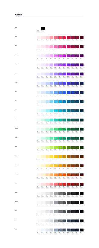
With these design requirements in mind, I focused on creating a landing page that would embody Polio CRM’s brand values—elegance, professionalism, and user-centricity. Using a modern, minimalist approach, I centered the design around Polio’s primary brand color, black, while incorporating contrasting elements for visual interest and easy readability. This color scheme gave the page a sleek, professional look, aligning well with Polio CRM’s innovative image.

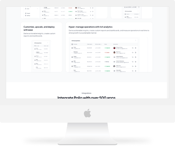
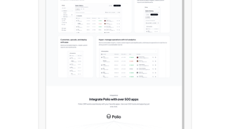
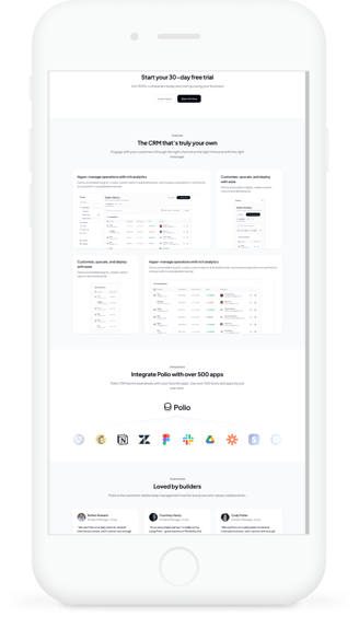
To make the CRM’s benefits clear, I used high-quality visuals, including product screenshots and relevant illustrations, to showcase the most important features of Polio CRM. Each visual was chosen to help users quickly understand how the product could solve their needs, from customer insights to workflow management. I crafted concise, engaging messaging to highlight Polio’s unique selling points, ensuring every section communicated value without overwhelming the user.

Prioritizing a user-friendly experience, I designed intuitive navigation and strong call-to-action buttons to guide users smoothly through the page and encourage them to take action—whether signing up for a trial or exploring a demo. I also optimized the layout for fast loading, using image compression techniques to balance quality and speed.

Lastly, I added social proof elements, including client logos and testimonials, to build trust and demonstrate Polio CRM’s reliability. This final touch added credibility, helping potential customers feel confident in Polio as their CRM solution.

This project was an exciting learning experience, where I learned to blend design aesthetics with functionality, create user-centered navigation, and deliver a seamless experience for all devices, making Polio CRM’s landing page both elegant and effective.

Problems and solution

Design a minimalist, modern landing page that reflects Polio CRM’s professionalism while showcasing its key features and benefits in a way that resonates with diverse business users. Through clear messaging, high-quality visuals, intuitive navigation, and strong calls-to-action, the landing page will guide users toward engagement, making it easy for them to understand Polio CRM’s value and take action on any device.

Businesses seeking a reliable, efficient CRM often face difficulty finding a platform that combines ease of use with powerful features and a visually appealing, professional design. Polio CRM’s target audience—ranging from small startups to large enterprises—needs a landing page that clearly communicates the unique value of Polio CRM and encourages users to take the next step, such as signing up for a trial or requesting a demo.

Possible solution
Problem Statement
  Empathize phase
  Empathize phase

Empathize phase

  1. What are the biggest challenges you face with your current CRM system?

  2. How easy is it to find important customer insights in your CRM?

  3. What CRM features do you use most often, and why are they important?

  4. Are there any features you wish your CRM had to make your job easier?

  5. How important is it for your CRM to be customizable? In what ways?

  6. When you first visit a CRM landing page, what information are you looking for?

  7. What elements on a landing page make you feel more confident in trying a new CRM?

  8. How helpful do you find testimonials or customer logos on a CRM landing page?

  9. What type of call-to-action (like “Try for Free” or “Request a Demo”) motivates you most?

  10. What would make the CRM landing page easier and more enjoyable to navigate?

User Interview

User journy map

Now that I knew which features would bring the most value to Polio CRM, I focused on understanding how they would integrate into the platform's existing structure. To visualize this, I created an application map.

To design a landing page that resonates with Polio’s target audience—businesses ranging from small startups to large enterprises—I began by putting myself in the users’ shoes. I imagined the needs of sales teams, customer service reps, and managers looking for a CRM that would simplify their workflows and enhance customer relationships. Through research, I explored competitor sites to see what was working in the market, gaining insights into what features and benefits businesses prioritize in CRM solutions. This step helped me build a foundation for understanding the needs and pain points of potential Polio CRM users.

For the Polio CRM landing page project, I embraced the design thinking process to create a solution that felt both functional and inspiring. My goal was to design a visually appealing, user-centric experience that clearly communicated Polio’s unique value. Here’s how I approached each step:

Design Thinking Process

User Reserch

  1. Identify the specific challenges users face in their current CRM experiences, such as workflow complexity or difficulty in accessing customer insights.

  2. Understand the core features and benefits that sales, customer service, and management teams look for in a CRM, ensuring the landing page prioritizes the most relevant solutions.

  3. Discover user expectations for a CRM landing page layout and content, focusing on elements that build trust and encourage engagement

  1. What specific challenges do users face in their current CRM systems, particularly regarding workflow complexity or accessing critical customer insights?

  2. Which CRM features are most valuable to sales teams, customer service representatives, and managers for improving productivity and customer relationship management?

  3. What benefits or unique selling points do users prioritize when choosing a CRM solution?

  4. What design elements on a CRM landing page help users feel more confident in trying or adopting a new CRM system?

  5. How do users expect to interact with call-to-action buttons, testimonials, or product feature highlights on a CRM landing page?

Research Goals
Research Questions
Interview Question
Key Insights
  1. Users struggle with complex navigation and time-consuming processes in their current CRM.

  2. Key customer data is hard to find, highlighting the need for more accessible data displays.

  3. Frequently used features include customer data management, automation, and reporting tools.

  4. Users desire intuitive features like data visualization and task prioritization.

  5. High customizability is essential to tailor CRM tools to specific team needs.

  6. Users initially look for feature descriptions, benefits, and pricing on a landing page.

  7. Trust elements, like testimonials and security assurances, increase user confidence.

  8. Testimonials and client logos significantly boost trust and perceived credibility.

  9. “Try for Free” or “Request a Demo” calls-to-action are most appealing to users.

  10. Users prefer a clean, easy-to-navigate layout with clear, prominent calls-to-action.

Competitor Analysis

In analyzing key CRM competitors—Salesforce, HubSpot, and Zoho—Polio CRM can identify essential design elements that appeal to diverse business needs. By focusing on customizability, ease of use, clear pricing, and trust-building testimonials, Polio CRM can effectively position itself to attract both large enterprises and smaller, cost-conscious teams.

Define phase

With a clearer view of the audience’s needs, I defined key objectives for the landing page. The design needed to be visually stunning, intuitive, and professional to reflect Polio CRM’s brand. I wanted to highlight the CRM’s unique features and advantages, emphasizing simplicity, reliability, and customization. The goals were clear: capture user attention, communicate Polio’s unique selling points, and encourage action through compelling calls-to-action.

User Persona
Emoathy Map

Ideate phase

This stage was all about brainstorming and planning. I mapped out possible layouts, keeping Polio’s brand image in mind, and prioritized a minimalist and modern design approach that would convey elegance and professionalism. My goal was to incorporate Polio’s primary brand color—black—while adding contrast to enhance visual interest and legibility. I sketched ideas for the hero section, product highlights, and testimonials, thinking about how each element could engage users while also delivering a seamless experience across devices.

Task Flow

In the initial brainstorming phase, I focused on crafting a layout that would bring Polio’s brand image to life through a minimalist, modern design. Centering on elegance and professionalism, I incorporated Polio’s primary brand color—black—and paired it with contrasting accents to keep the design visually engaging and readable. I sketched out the hero section, product highlights, and testimonials, aligning each element to draw users in while ensuring a seamless experience across devices. This stage set a solid foundation for a clean, intuitive layout tailored to Polio’s audience and brand goals.

Brainstorm Ideal

With a clear understanding of how these new features would integrate into Polio CRM’s structure, I next focused on how users would interact with them to accomplish key tasks. I started by creating a UI Requirements document to identify essential tasks aligned with user goals, detailing the requirements for each screen to ensure task completion.

Building on these tasks, I then developed task flows to map out the steps users would take and the primary pages they would navigate to achieve their objectives.

Application Map

To gain a more comprehensive understanding of the user's experience with the new features, I developed a detailed user flow that delves into the various scenarios users might encounter. This user flow maps out the different paths and decisions users face as they navigate through key tasks, allowing me to empathize more deeply with their needs and challenges. By exploring each step and potential decision point, I can better anticipate how users interact with the platform, the obstacles they might face, and the support they need to complete their objectives successfully. This approach enables me to design solutions that address user pain points and create a seamless, intuitive experience.

User's Journey

Design phase

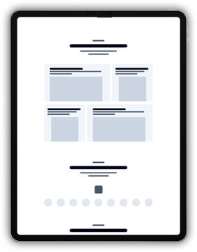
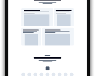
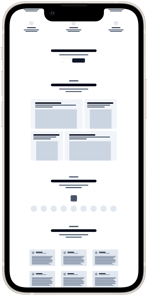
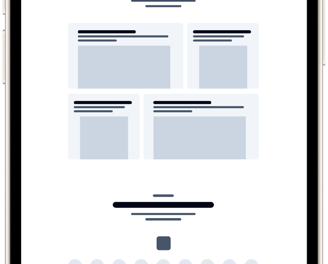
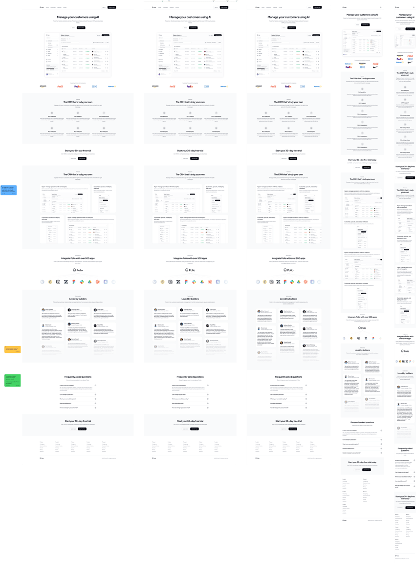
For the Polio CRM project, the low-fidelity wireframe provides a strategic framework for the design, focusing on essential layout and user flow without intricate visual details. This stage allows for rapid iteration and testing of key elements, ensuring that the structure aligns with user needs and the project’s goals. By mapping out content hierarchy and primary interactions, the low-fidelity wireframe serves as a foundational step, guiding the design towards an intuitive and user-centered final product.

Low Fidelity Wirframe
Hidh Fidelity Wirframe

The high-fidelity wireframe for the Polio CRM project represents a polished and fully detailed design, meticulously prepared to be developer-ready. Every element has been refined for a professional presentation, incorporating precise visuals, exact color schemes, and complete typography. Detailed annotations accompany each feature to clarify functionality, ensuring that all design components align with user requirements and project goals. This comprehensive and carefully documented wireframe provides developers with everything needed for seamless implementation, making it a dependable blueprint for the final build.

Handoff

In the final phase of the Polio CRM project, the design is meticulously refined and fully documented for handoff. The final prototype incorporates all user feedback and design adjustments, presenting a cohesive and interactive model that closely mirrors the intended user experience. This handoff package is developer-ready, complete with detailed specifications, annotations, and style guides to ensure accuracy and consistency in implementation. By providing a clear, comprehensive prototype, the handoff stage bridges design and development, supporting a smooth transition from concept to a fully functional product.

a black cell phonea black cell phone
Test Phase
Thank you for your time