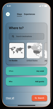
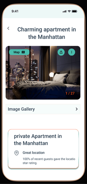
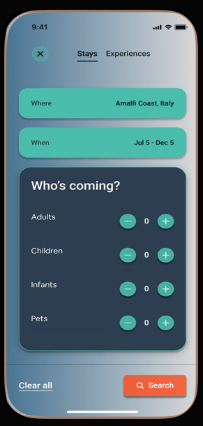
Reimagining
Airbnb
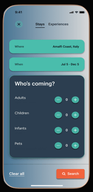
A human-centered approach to redesigning Airbnb’s mobile app booking flow, addressing real-world challenges to create a seamless, delightful user experience.


Crafting a Frictionless Booking Journey for Travelers
Reimagining the Joy of Travel
Through personal experiences and user feedback, I noticed a recurring theme: the magic of travel sometimes gets lost in the logistics of booking. Users struggle with lengthy processes, unclear costs, and a lack of instant feedback during their journey to secure a stay. This friction can turn an exciting experience into a frustrating one.
This case study is a journey of its own—a deep dive into the heart of Airbnb’s booking flow. My mission? To identify pain points, craft solutions, and reimagine the process with empathy and creativity. By putting the traveler first, this redesign aims to bridge the gap between dreams of wanderlust and the reality of making them come true.
Airbnb’s booking flow, while functional, involves multiple steps that can feel overwhelming, especially for new users. Issues like unclear pricing breakdowns, lengthy navigation, and lack of instant feedback contribute to user drop-off during the booking process.
Problem Statement
Goals and Objectives
Streamline the booking process to reduce cognitive load.
Improve transparency in pricing and payment options.
Enhance the mobile app’s usability and accessibility for a global audience.
Increase user confidence and trust during the booking journey.
Design Process Journey
I began with a strong research foundation, starting with heuristic analysis to identify usability issues in the existing product. Then, I conducted competitive analysis to understand market trends, followed by secondary research to gather insights from existing data. This research led to the creation of user personas and journey mapping, which helped visualize user paths and pain points.
With this knowledge, I moved into ideation and concept development, exploring various design solutions. I created low-fidelity wireframes to outline the structure, followed by high-fidelity design development to refine visuals. I then built an interactive prototype to test with real users, gathered feedback, and made final adjustments. The last step was the handoff to development, ensuring a smooth transition for implementation.
1: Research Plan
To deliver a user-centered redesign of Airbnb’s booking flow, I developed a comprehensive research plan aimed at uncovering user needs, pain points, and opportunities for improvement.
Step 1: Heuristic Analysis
I started by performing a heuristic analysis of Airbnb’s current booking flow using Jakob Nielsen’s 10 Usability Heuristics. This helped identify usability issues such as lack of real-time feedback, unclear terminology, and opportunities for error prevention.
Step 2: Competitive Analysis
Next, I conducted a competitive analysis of Airbnb’s booking process against leading competitors like Booking.com, Expedia, and Hopper.
Focus Areas: Ease of navigation, pricing transparency, and feature innovation.
Step 3: Secondary Research
To understand user sentiment, I analyzed app store reviews, online forums, and social media discussions related to Airbnb’s app.
Focus: Recurring themes in user feedback, such as frustrations with the booking process or desired features.
Step 4: User Personas
Based on insights from heuristic analysis and secondary research, I created user personas to represent key user groups.
Details: Demographics, goals, behaviors, pain points, and motivations during the booking process.
Step 5: Journey Mapping
Finally, I developed user journey maps to visualize the current booking process and identify emotional highs, lows, and friction points.
Focus: Key moments of interaction from search to payment confirmation.
step 1:
Heuristic Analysis
To lay the foundation for an effective redesign, I began by conducting a heuristic analysis of Airbnb’s booking flow. This method allowed me to systematically evaluate the usability of the existing interface, identifying strengths, weaknesses, and areas for improvement.
The analysis focused on the entire booking journey, from the initial search to the final payment confirmation. Leveraging Jakob Nielsen’s 10 Usability Heuristics, I dissected key touchpoints to uncover issues that could hinder user experience.


Key Findings


Visibility of System Status
While applying filters, users lacked real-time feedback, leading to confusion about whether changes were applied successfully.


Match Between System and the Real World
Some terms, such as "Cleaning Fee," felt ambiguous or unclear, making it difficult for users to grasp the full cost breakdown.


Error Prevention
Users were not warned when selecting unavailable dates, resulting in frustration and additional steps to resolve the issue.


Recognition Rather Than Recall
Comparing listings required users to switch back and forth between pages, relying heavily on memory to differentiate options.


Recognition Rather Than Recall
Comparing listings required users to switch back and forth between pages, relying heavily on memory to differentiate options.
Final Payment Screen Review and Recommendations
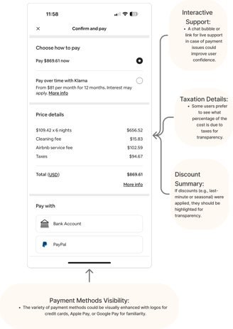
The final payment screen is a critical step in the user journey, as it determines whether users proceed to complete their booking. After analyzing this screen, I identified several strengths and areas for improvement:


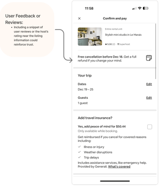

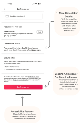
User Feedback or Reviews:
Include a snippet of user reviews or the host's rating near the listing information to reassure users about their choice.
Recommendations:
Payment Methods Visibility:
Use logos for payment methods like credit cards, Apple Pay, or Google Pay for improved usability and familiarity.
Interactive Support:
Add a chat bubble or direct link for live support to assist users facing payment issues. This would increase user confidence and reduce abandonment rates.
Taxation Details:
Specify the percentage of the cost allocated to taxes to improve transparency.
Discount Summary:
Highlight discounts, such as last-minute deals or seasonal offers, visually within the price breakdown to enhance user satisfaction.
More Cancellation Details:
Add a link or expandable section with a detailed refund breakdown to support informed decision-making.
Loading Animation or Confirmation Preview:
Implement a brief confirmation preview or success animation after clicking “Confirm and Pay” for a seamless transition.
Accessibility Features:
Ensure compliance with accessibility standards, including high-contrast designs, larger touch targets, and screen reader compatibility.




Step 2:
Competitive Analysis
To ensure the redesigned booking flow meets modern travelers’ expectations, I analyzed key competitors in the online travel and hospitality sector. These platforms include Booking.com, Expedia, and Hopper, each known for their unique approaches to usability, pricing transparency, and mobile-first innovations.
I conducted the analysis by evaluating the following aspects for each competitor:
Ease of Navigation: Simplicity and clarity in moving through the booking process.
Pricing Transparency: Clear and upfront cost breakdowns.
User Feedback Integration: Use of reviews, ratings, and other trust-building elements.
Support and Assistance: Availability of live chat or help features.
Feature Innovation: Unique tools or features that enhance the user experience.
Mobile Optimization: Performance and usability on mobile devices.


Methodology


Strengths:
Pricing Transparency: Offers detailed breakdowns of all fees (taxes, service charges) upfront, minimizing surprises during payment.
Instant Feedback: Provides real-time availability and price updates during the search and filtering process.
Trust Indicators: Includes customer reviews and ratings prominently, even during checkout, to build confidence.
User Assistance: Features a 24/7 live chat option and easy access to customer service via mobile.
Competitive Gaps
While Airbnb excels in fostering an emotional connection with its users and providing aspirational travel options, the following areas represent opportunities for improvement based on competitor benchmarking:


Weaknesses:
Overloaded Interface: The mobile app can feel cluttered with promotional banners and dense information.
Lack of Personalization: Does not leverage user preferences for a tailored search experience.
1. booking.com
2. Expedia
Strengths:
Streamlined Navigation: Intuitive design simplifies moving from search to booking, particularly on mobile.
Price Matching: Offers guarantees and tools to compare prices across platforms.
Integrated Experience: Combines flights, stays, and car rentals in a seamless interface, reducing the need to visit multiple websites.
Cancellation Details: Offers comprehensive and easy-to-understand cancellation policies.
Weaknesses:
Limited Feedback: Lacks interactive elements like real-time support during booking.
Generic Design: While functional, the interface lacks the emotional and aspirational design seen in platforms like Airbnb.
3. Hopper
Strengths:
Feature Innovation: Uses AI-based predictions to suggest the best times to book, saving users money.
Minimalist Design: Focuses on simplicity, with visually appealing and easy-to-understand interfaces.
Trust Elements: Includes price protection and trip insurance, reassuring users about their bookings.
Push Notifications: Keeps users informed of price changes and deals without needing to revisit the app.
Weaknesses:
Focus on Flights: While strong in flight bookings, it lacks the depth and variety of options for accommodations compared to Airbnb.
Limited Filtering Options: Users may find it harder to fine-tune their searches for specific needs.


Action Plan and Recommendations
To address the identified gaps and implement innovative ideas:
Enhance Pricing Transparency:Redesign the cost breakdown section to ensure all fees are shown upfront during the search process.
Implement Real-Time Feedback Features:Develop dynamic tools for updating prices and availability as users filter and search properties.
Introduce AI-Powered Personalization:
Build AI-driven predictive tools to recommend listings based on user preferences and behavior.
Simplify Navigation:Conduct usability testing to reduce interface clutter and streamline navigation, especially on mobile devices.
Improve Support Accessibility:Add real-time support options like live chat to assist users with their questions or issues during booking.

Step 3:
Secondary Research
To understand user sentiment, I analyzed app store reviews, online forums, and social media discussions about Airbnb’s app. The research revealed the following recurring themes:
Users expressed frustration over hidden fees and unclear cost breakdowns.
Example Quote: “The price shown initially is never what I end up paying. Why not show everything upfront?”
Limited Support Options
Users frequently mentioned difficulty accessing timely support during the booking process.
Example Quote: “I tried to contact support during my booking, but it was so slow I gave up.”
Complex Filters and Search
Filtering options were seen as overwhelming, making it harder to find suitable accommodations.
Example Quote: “Too many filters make it confusing; I just want to search without being overwhelmed.”
Cancellation and Refund Frustrations
Users felt cancellation policies were unclear and refunds took too long.
Example Quote: “It’s hard to know if I’ll get my money back when I cancel—it feels like a gamble.”ons or issues during booking.
This secondary research highlights critical areas for improvement in Airbnb’s booking flow: increasing transparency, simplifying navigation, enhancing customer support, and improving clarity around policies. These findings validate the importance of addressing user pain points uncovered in the competitive

Outcome
Key User Insights


Step 4:
User Personas

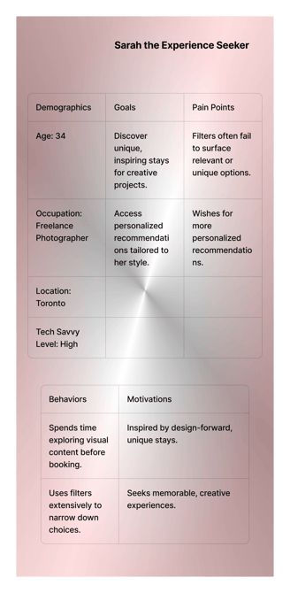

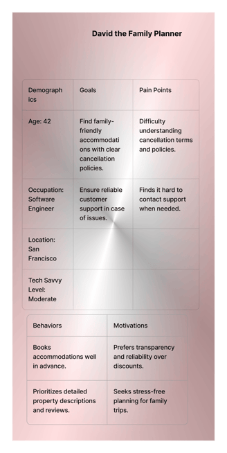

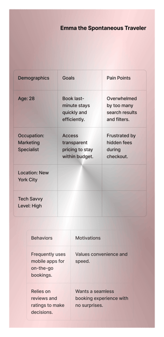


Based on insights from the heuristic analysis and secondary research, I developed user personas to represent key user groups. These personas help ensure that design decisions remain user-centered and address real needs.


Step 5:
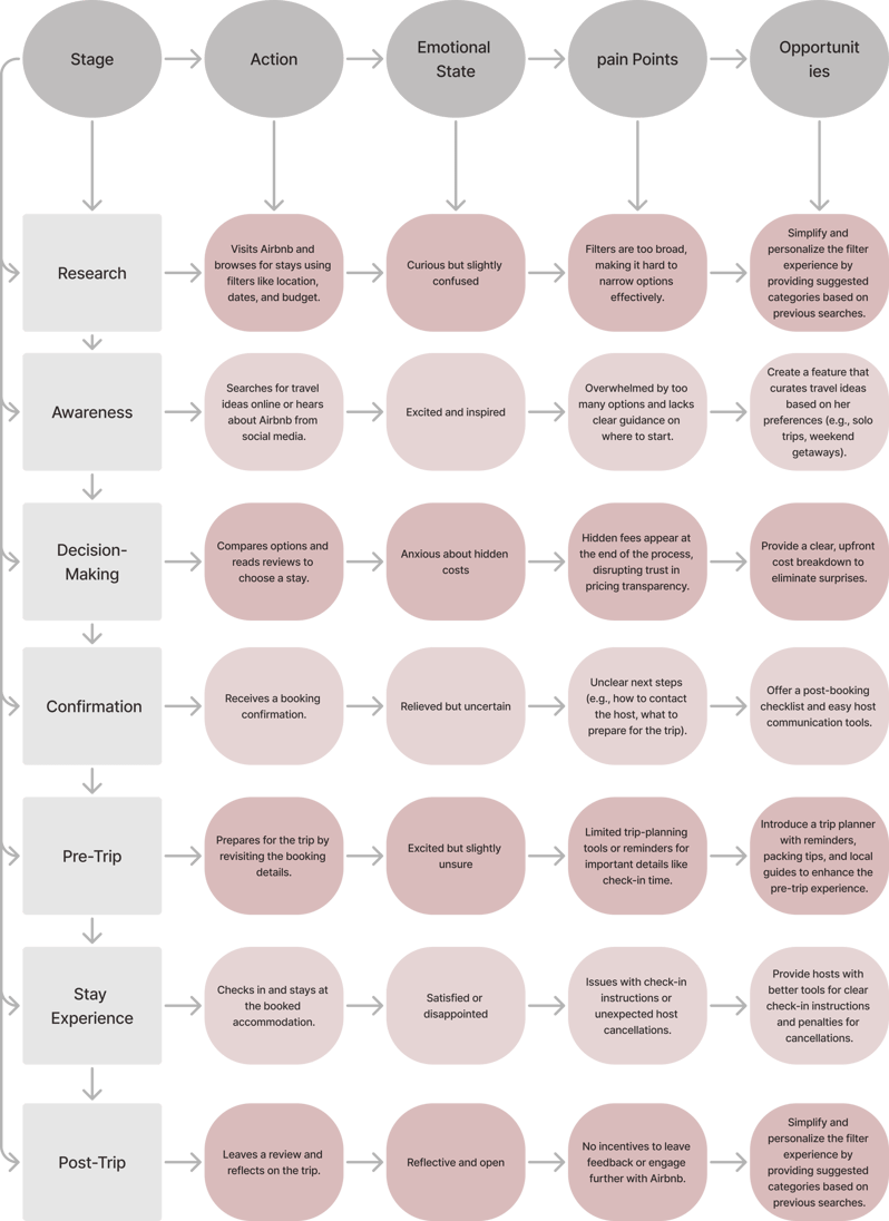
User Journey Mapping
As I mapped the journeys of Sarah, Emma and David, a clear narrative emerged: while Airbnb provides a unique platform for travel planning, the booking process often leaves users feeling frustrated and uncertain. Emotional friction—stemming from confusion during filtering, hidden fees, or inconsistent policies—frequently turns an exciting experience into a stressful one.
For instance, Sarah, the spontaneous solo traveler, faces frustration when navigating overwhelming filters and encountering hidden costs at checkout. Emma, the adventure couple, struggle with the lack of tools to seamlessly plan a multi-city itinerary, which leads to missed opportunities and confusion over cancellation terms. Meanwhile, David, the business traveler, feels uncertainty due to unreliable filters and the absence of instant confirmation options, leaving him worried about potential host cancellations.
These journeys highlight a shared challenge: users crave clarity, confidence, and tools tailored to their specific goals. Without real-time feedback—such as updated pricing and availability—or personalized features like trip planners and business-friendly options, the booking process risks losing its magic. These insights serve as the foundation for reimagining Airbnb’s booking flow, prioritizing user-centric solutions that bridge the gap between aspiration and action.

Research Insights
The goal of the research was to understand the pain points and needs of travelers when booking accommodations online and identify opportunities for improvement in the Airbnb user journey.
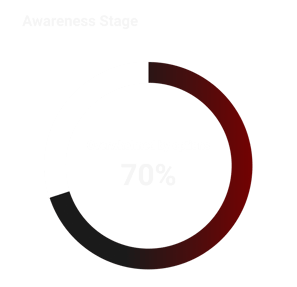
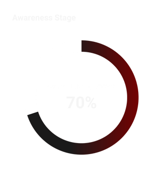
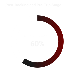
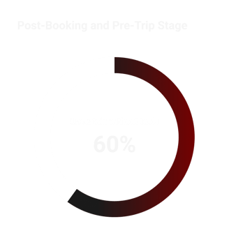


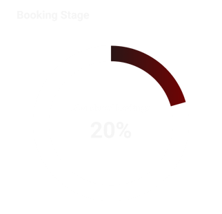
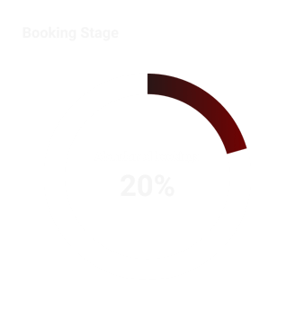
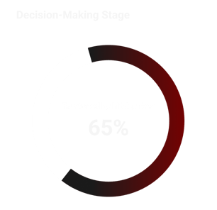
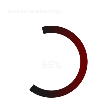
The research highlighted clear opportunities to enhance the Airbnb experience by addressing user pain points with thoughtful, user-centered solutions. Prioritizing simplicity, transparency, and personalization can significantly improve user satisfaction and trust.
2: Ideation & Concept Development
After identifying user pain points thorough research, I transitioned into brainstorming innovative yet practical solutions. The goal was to create a user-friendly and personalized experience addressing the main challenges: overwhelming search results, lack of personalization, and inefficiencies in the booking flow.
Generating ideas
From these ideas, I identified the most impactful and feasible solutions to prototype:
I explored several concepts inspired by the research findings:
Prioritizing Solutions
A personalized booking dashboard to provide tailored recommendations and simplify user navigation.
An interactive map feature that combines smart filters and geographical tools for better decision-making.
A streamlined booking flow with fewer steps and transparent pricing to reduce friction.
These concepts formed the foundation for the wireframing stage, where I translated these ideas into actionable designs.

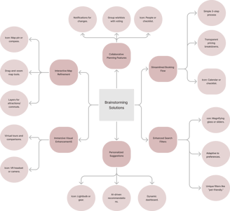




Enhanced Filters: Smart, adaptive filters that refine search results based on user behavior and preferences.
Personalized Suggestions: AI-powered recommendations tailored to user history, such as “Because you liked this…” suggestions.
Interactive Map Integration: Tools that allow users to refine searches geographically and view commute distances or nearby attractions.


Seamless Communication: Features like quick-reply templates and chat assistants to simplify host-user interactions.
Streamlined Booking Flow: A redesigned, transparent 3-step booking process for better usability.
Collaborative Wishlists: Enabling groups to save, share, and vote on properties for collective decision-making.


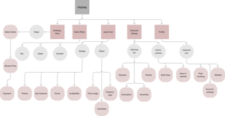
Site Map and User Flow Development



3: low fidelity Wire framing
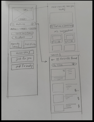
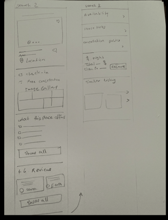
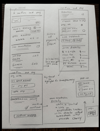
To bring the brainstormed ideas to life, I began with low-fidelity wireframes. These basic sketches focused on structure, layout, and user interaction flow. Starting simple allowed me to iterate quickly and address usability challenges early.



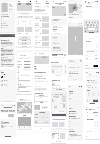
4: High-Fidelity Wireframes



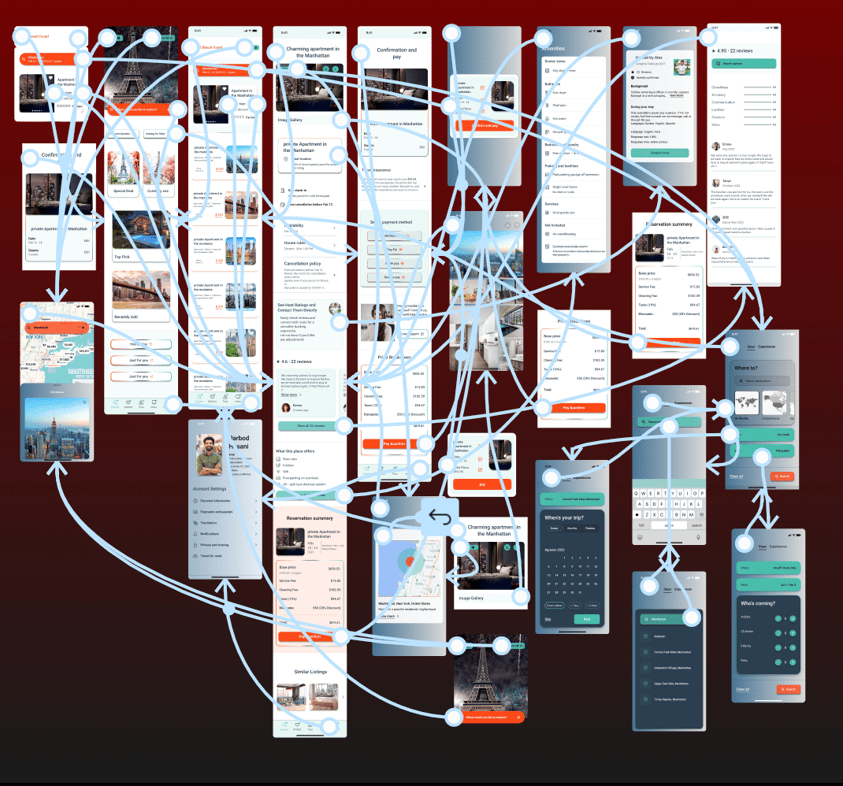
5: Prototyping Wireframes
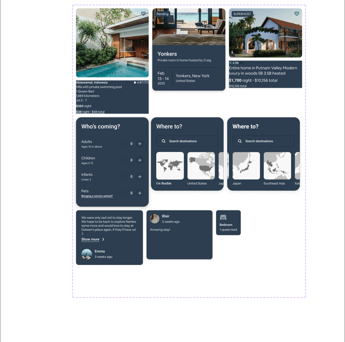
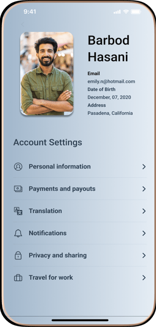
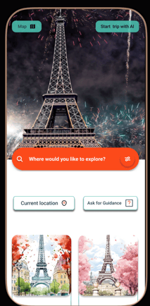
In the prototyping phase, I transformed insights and ideas into tangible designs to address the identified pain points. Starting with low-fidelity wireframes, I focused on refining the booking flow by simplifying navigation, ensuring pricing transparency, and enhancing real-time feedback. These initial wireframes allowed for quick iteration based on feedback. Moving to high-fidelity prototypes, I incorporated polished visuals, intuitive interactions, and a cohesive design system aligned with Airbnb’s branding. The prototypes served as a blueprint for usability testing, helping to validate design decisions and ensure the solutions met user needs effectively.
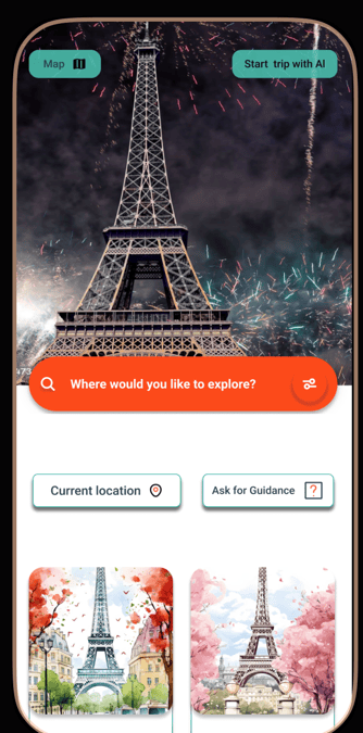
5: User Testing and feedback
In the User Testing & Feedback phase, I consistently prioritized the user’s needs to validate the effectiveness of the proposed solutions and gather insights for further improvements. Usability testing sessions were conducted with target users to evaluate the redesigned booking flow and overall experience. Participants were asked to complete specific tasks, such as finding a stay, comparing options, and completing a booking.
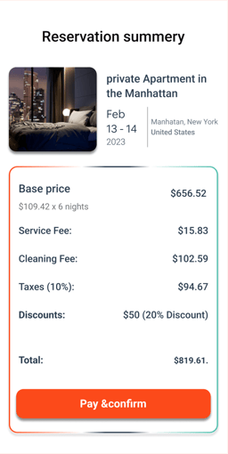
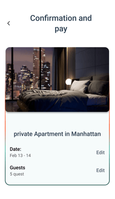
One key focus was ensuring transparent pricing throughout the entire booking journey. Clear and upfront costs were displayed at every stage, eliminating confusion and hidden fees. During the confirmation and payment stages, users were presented with a detailed summary of their booking, making the process smooth and reassuring.
Key findings from the testing revealed areas of success, such as improved navigation, clarity in pricing transparency, and a smoother booking process. However, users also suggested further enhancements, like simplifying filters and adding more visual cues during the booking confirmation stage.
The feedback informed iterative design changes, ensuring the final solution not only met user needs but exceeded their expectations. This phase reinforced the importance of a user-centered approach, demonstrating how transparency and thoughtful design can create a seamless, satisfying experience.
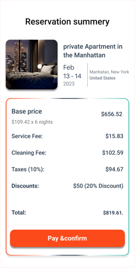
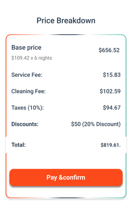
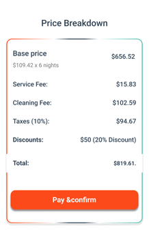

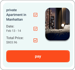

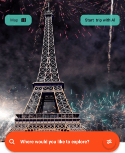
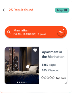
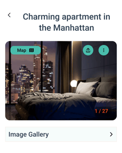
During the research phase, I focused on creating a seamless and straightforward flow without overwhelming users. I ensured that the best option with the most competitive price was always displayed clearly at the top of the screen. Unnecessary details were removed, allowing users to quickly understand everything at a glance.


6: final delivery and hand off
I've made sure to organize all design files in Figma and FigJam, covering every detail, from color and typography to grid systems, components, low-fidelity and high-fidelity designs, and prototypes. The goal was to streamline the design handoff process and ensure everything is in order for future use. I’ve structured the files systematically, grouping them by categories such as wireframes, mockups, interactive prototypes, and assets. All files are consistently named (e.g., Homepage_HiFi_V1.fig), making it easy to find exactly what’s needed quickly and efficiently. This organization ensures a smooth transition and makes it easy to access and understand the design intent and specifications."meets the highest standards and aligns with user needs.

