
lumilense
NEW EMPTY PAGE
project

we partnered with New Character Store, a Tehran-based retailer specializing in high-quality eyewear, to design their first online store. With a clear mission to create a seamless, user-friendly experience for purchasing sunglasses, the project required a comprehensive UX/UI design approach, covering desktop and mobile platforms.
The store's representative, Saman Hooshyar, envisioned a platform that not only showcased their extensive product range but also simplified the customer's journey from browsing to checkout.
My role was to bridge design aesthetics with functionality while aligning with the brand's premium identity.
overview
Goals, and Problems
Designing the New Character Store’s online sunglasses shop required balancing tight deadlines with creating a responsive, user-friendly design. Close collaboration with the product manager and development team ensured the design met both employer expectations and user needs while integrating seamlessly into the final product.
The project goals were clear:
Create a User-Friendly Platform: The online store had to cater to diverse users, offering a smooth shopping experience across both desktop and mobile devices.
Streamlined User Experience: Simplifying the user journey from browsing products to completing purchases was essential.
Reflecting Brand Identity: The design needed to reflect the professionalism and modern image of the New Character Store.
Adapting to Future Needs: The design had to be scalable and flexible, allowing for updates and modifications as the business evolved.
The primary challenges stemmed from:
Fragmented Requirements: Compiling all necessary information, such as product details, images, and page content, from the employer on time.
Time Constraints: Completing the design within the agreed 40-business-day timeframe while maintaining high-quality standards.
Collaborative Workflow: Coordinating efficiently with the development team to address any design issues after delivery.
User-Centric Approach: Ensuring that the design was intuitive, responsive, and catered to the needs of the store’s target audience.
The project started with a deep dive into the employer’s vision, brand, and target audience. Collaborative planning with the product manager ensured every page, from homepage to checkout, embraced user-centered design. Feedback on wireframes and prototypes refined the aesthetics and functionality. Over a 40-business-day timeline, agile methods prioritized simplicity, scalability, and adaptability to evolving needs.mplicity and scalability in the final design.
Process and Approach

1. Discovery Phase
I began with comprehensive research:
Competitor Analysis: Studied leading e-commerce platforms for eyewear to identify trends, features, and gaps.
User Personas: Defined profiles for typical users, including busy professionals and fashion-conscious shoppers.
Collaborative Planning: Worked closely with Saman to gather brand assets, product images, and specifications.
Competitor Analysis
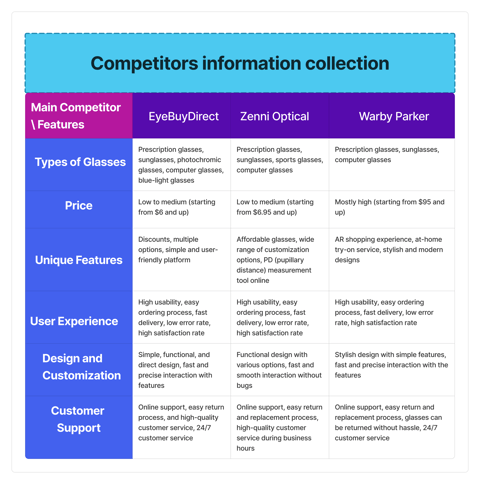
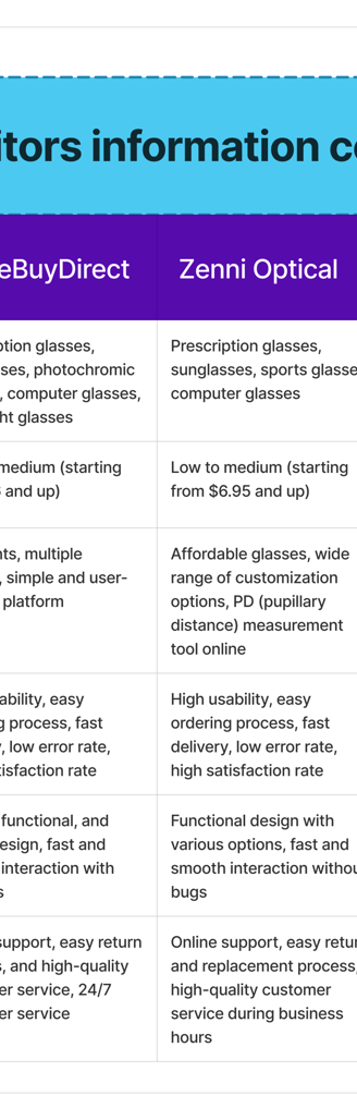
To make the online eyewear store stand out, a detailed competitor analysis was conducted on EyeBuyDirect, Zenni Optical, and Warby Parker. EyeBuyDirect led with a 90% success rate, 4-minute task completion time, and a 4.8 satisfaction score, thanks to its clean, professional UI. Warby Parker offered dynamic layouts and a 4.5 satisfaction score, while Zenni Optical, though stylish, lagged in learning time and recovery rates. Key insights like user-friendly fonts, instant feedback, and accessible navigation guided the design, resulting in a streamlined, efficient, and visually appealing solution tailored to the client’s needs.
Strengths, Weaknesses, Opportunities, and Threats
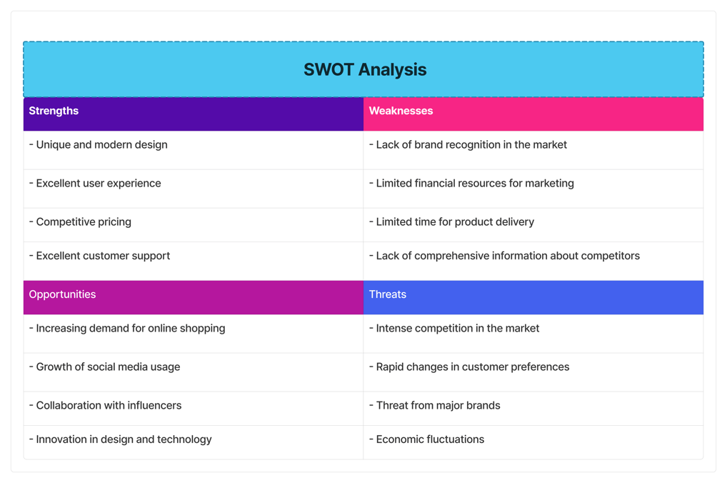
A SWOT analysis shaped our strategy, highlighting key strengths like modern design, competitive pricing, and a seamless user experience as the platform’s foundation. Weaknesses such as limited brand recognition, budget constraints, and delivery delays required prompt solutions.
Opportunities emerged from the growth of online shopping, social media engagement, and innovative technologies. However, challenges like intense competition, economic shifts, and changing customer preferences demanded adaptive, forward-thinking strategies to ensure success.
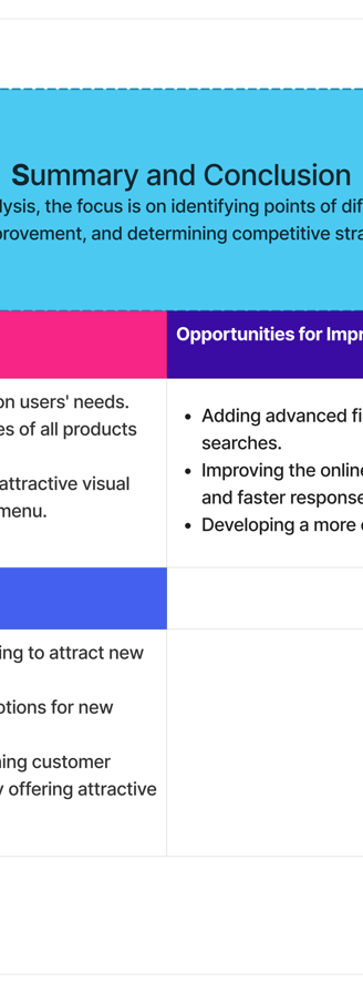
Summary and Conclusion
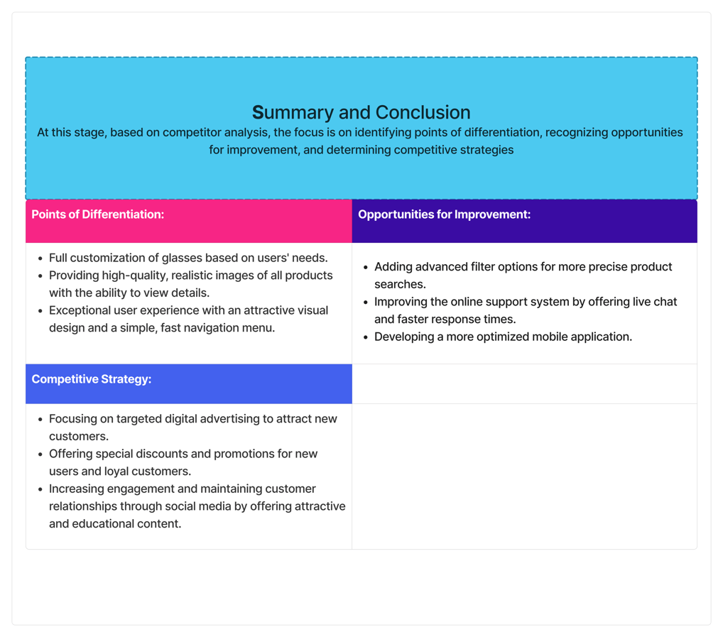
The competitor analysis revealed key opportunities to differentiate the online eyewear store. By focusing on full customization of glasses, high-quality product images with detailed views, and advanced filter options, we enhanced both functionality and aesthetics. An optimized mobile app and live online support further improved accessibility and user satisfaction.
The strategy included targeted digital ads, exclusive promotions for new and loyal customers, and engaging social media content. This holistic, user-centered approach ensures a standout shopping experience in a competitive market.
.User Research
Currently, online eyewear stores face issues such as customers' inability to experience the products in person, lack of trust in the quality and authenticity of the glasses, and insufficient product information. This results in a lower online purchase rate compared to physical stores and a much higher return rate. This information may have been gathered from meetings with business owners or through competitor analysis.
Problem Statement
Goal setting
The goal of user research for the online eyewear store is to identify the needs and challenges that users face when purchasing glasses online.

Interviews
Focus:
The interviews aimed to identify:
Key pain points in the online shopping process.
Features users value most, including product variety, easy navigation, and accurate descriptions.
Satisfaction levels with shipping, customer service, and the overall shopping experience.
Execution:
One-on-one interviews were conducted with five diverse participants, including experienced and first-time online buyers. Structured questions explored their preferences, challenges, and impressions of online eyewear stores, offering valuable insights to refine the website’s design and functionality.
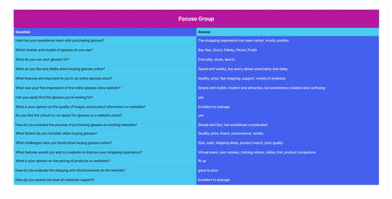
Purpose:
The interviews aimed to delve deeper into individual experiences and uncover specific challenges users face when purchasing glasses online. The goal was to understand the factors influencing their buying habits and decision-making processes while highlighting the importance of features like virtual try-on tools.
Purpose:
The focus groups were designed to identify shared frustrations and uncover common patterns in user preferences. By fostering group discussions, the goal was to gain insights into collective challenges and evaluate early design concepts.
Focus:
The sessions concentrated on:
Unveiling common pain points in the online eyewear shopping experience.
Gathering feedback on features like filtering options, virtual try-on tools, and visual design.
Exploring user expectations for navigation, product variety, and clarity of information.
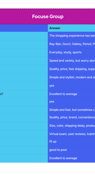
Focus Groups
Execution:
Groups of 6–8 participants were brought together to share their shopping experiences and provide feedback. Participants engaged in structured conversations about their needs, challenges, and expectations while testing initial design ideas.
Purpose:
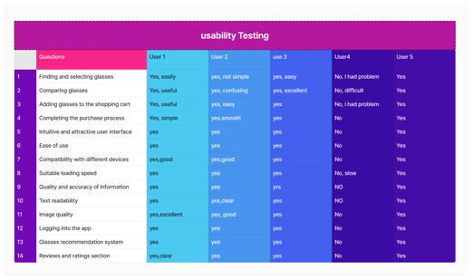
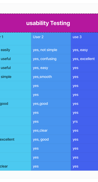
The usability testing aimed to evaluate how effectively users interact with prototypes or competitor platforms, identifying usability issues that hinder the overall shopping experience.
Focus:
Key areas of assessment included:
Clarity and intuitiveness of website navigation.
Ease of discovering and selecting products like glasses.
Users' ability to complete critical tasks, such as searching, comparing products, and completing a purchase.
usability testing
Execution:
Participants were tasked with:
Searching for glasses using filters.
Comparing multiple products.
Adding products to the cart and completing the checkout process.
Observations focused on task completion rates, challenges faced, and user feedback on navigation speed, interface design, and the accuracy of product information.
Result
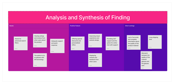

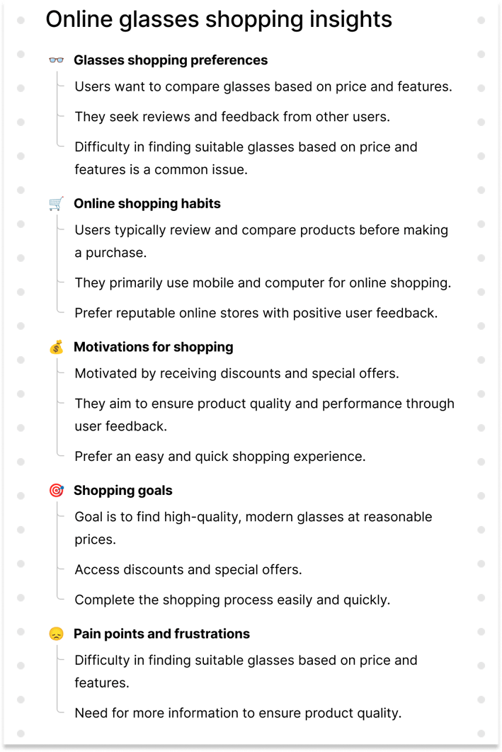
Positive Features
Special Discounts and Personalization (P1): Personalized offers make the shopping experience feel tailored and rewarding.
Enhanced Visual Design (P2): A modern, visually appealing website improves user engagement.
24/7 Support with Live Chat (P3): Continuous availability of support fosters trust and reliability.
User Reviews Displayed (P4): Feedback from other shoppers adds credibility and helps build trust.
Needs
Advanced Search Filters (N1): Users seek robust filters to streamline product searches.
Access to Ratings and Reviews (N2): The ability to view other users' opinions is crucial for informed decision-making.
Responsive Support (N3): Fast and reliable customer service is a key expectation.
AR Technology Try-On (N4): Virtual try-ons enhance confidence in choosing the right product.
Shortcomings
Lack of Detailed Product Information (S2): Missing or unclear details about materials can deter purchase decisions.
Long Shipping Times (S3): Delayed deliveries frustrate users and reduce satisfaction.
Quality Mismatches (S4): Disparity between ordered and received products erodes trust in the store.
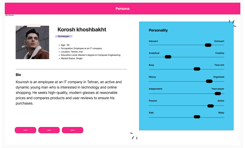
To ensure that my decisions moving forward in the design process are user-centered, I wanted to have a clear understanding of who my platform’s users are. By identifying key insights from my research and empathy map, I created a user persona to represent the target audience I will be designing for - Meet Korosh!
.Persona
During the project, I worked closely with Saman to gather essential brand assets, product images, and specifications. This collaborative effort was key in ensuring that the product visuals and brand messaging aligned with our design goals. Together, we aimed to create a seamless user experience that meets the needs of our target audience, making sure that all visual elements complemented the overall brand identity and user expectations.
.collaborative Planning
2.wireframe and Prototyping
Introduction
Wireframing and prototyping are essential steps in the design process that help translate research insights into tangible, user-centered designs. In this project, I used data from user research, personas, and competitive analysis to shape the structure and functionality of the website. The wireframes provide a blueprint for the layout, while prototypes bring these ideas to life, offering a clear view of the user experience and interaction design. These stages allowed me to refine user flows and create an intuitive, visually appealing interface.
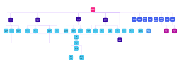

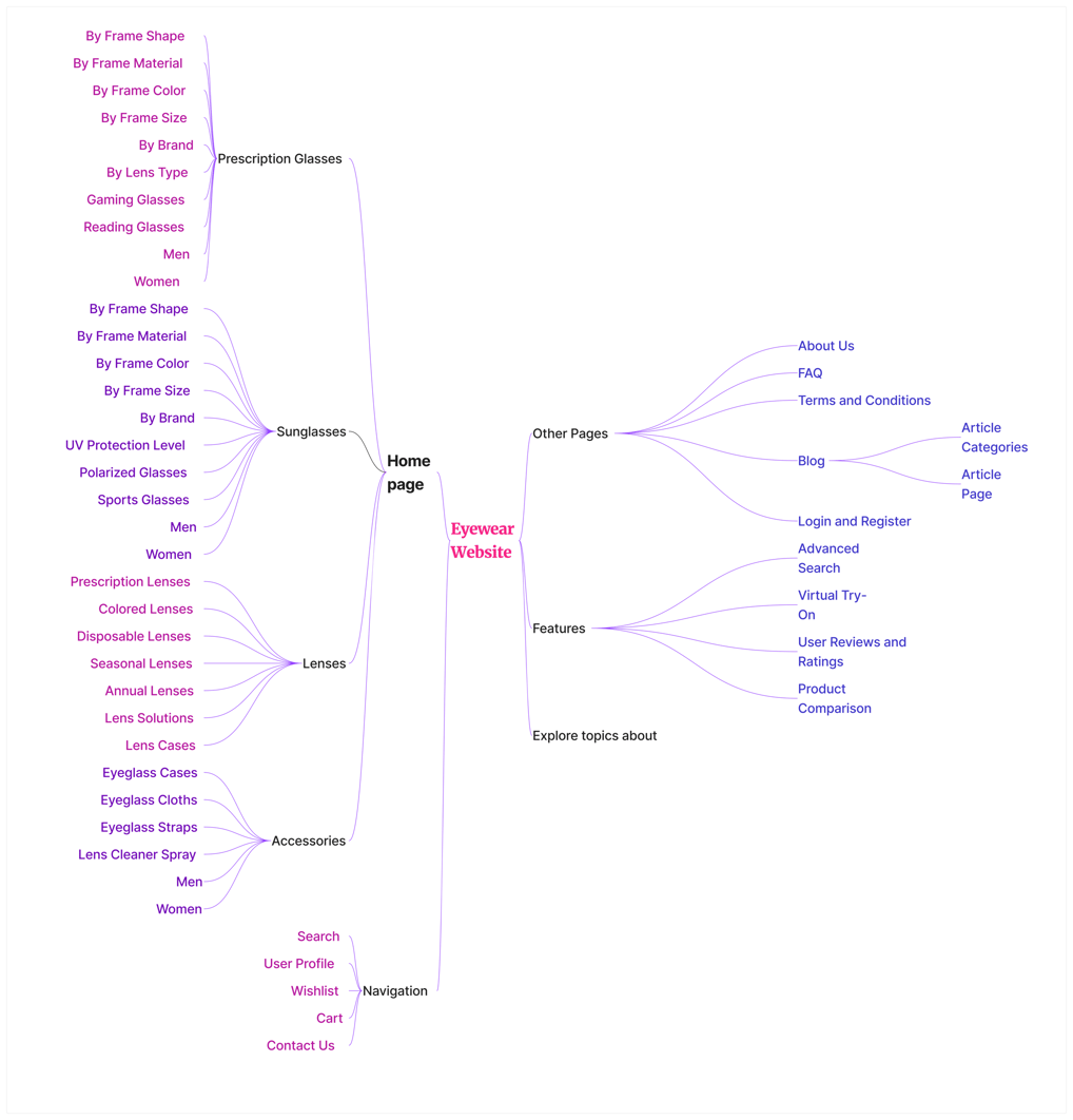

.Site Map
Wireframing and prototyping are essential steps in the design process that help translate research insights into tangible, user-centered designs. In this project, I used data from user research, personas, and competitive analysis to shape the structure and functionality of the website. The wireframes provide a blueprint for the layout, while prototypes bring these ideas to life, offering a clear view of the user experience and interaction design. These stages allowed me to refine user flows and create an intuitive, visually appealing interface.
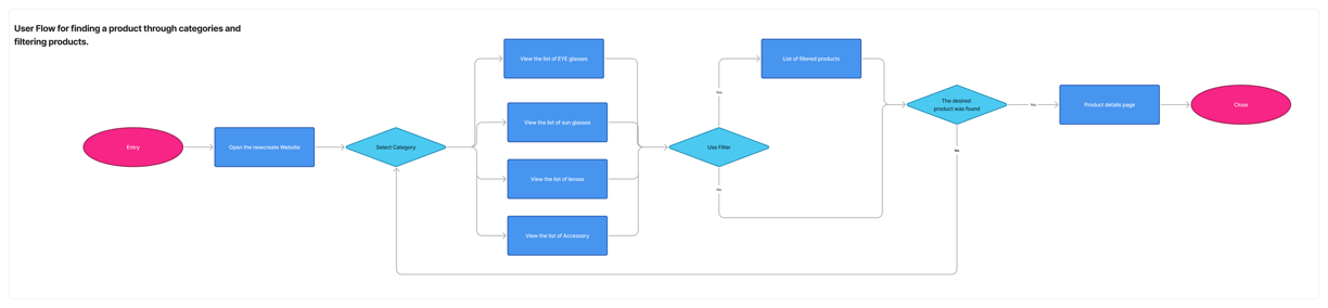
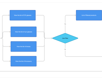
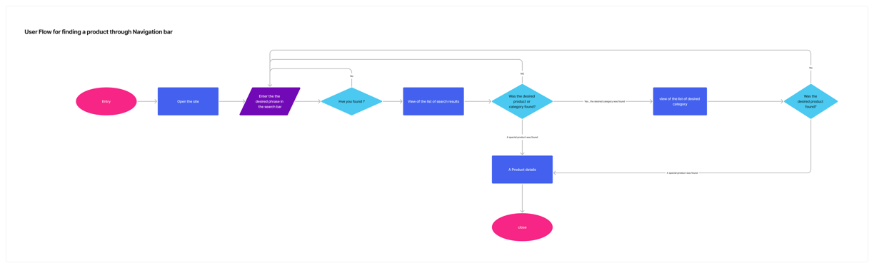
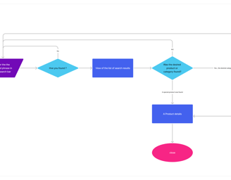
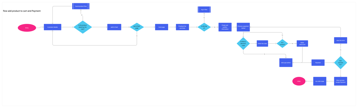
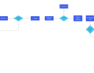
.User Flow
The key stages in the user’s experience are as follows:
Discovering Products: The user starts by browsing through product categories or searching for specific items.
Filtering Categories: Filters help users narrow down their search by various criteria like price, style, and size, making it easier to find what they want.
Adding Items to the Cart: Once a user finds a product they like, they add it to the cart with a simple click.
Checking Out: The user proceeds to checkout, where they review their items, enter shipping details, and complete the purchase.
These stages influence wireframe design by ensuring smooth navigation. For example, clear call-to-action buttons, accessible filters, and a straightforward cart layout are prioritized to enhance the user experience. This makes the site intuitive, guiding users effortlessly from discovery to purchase.
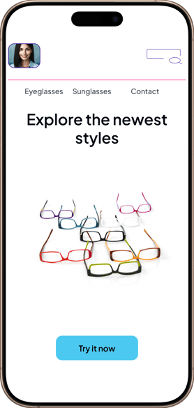
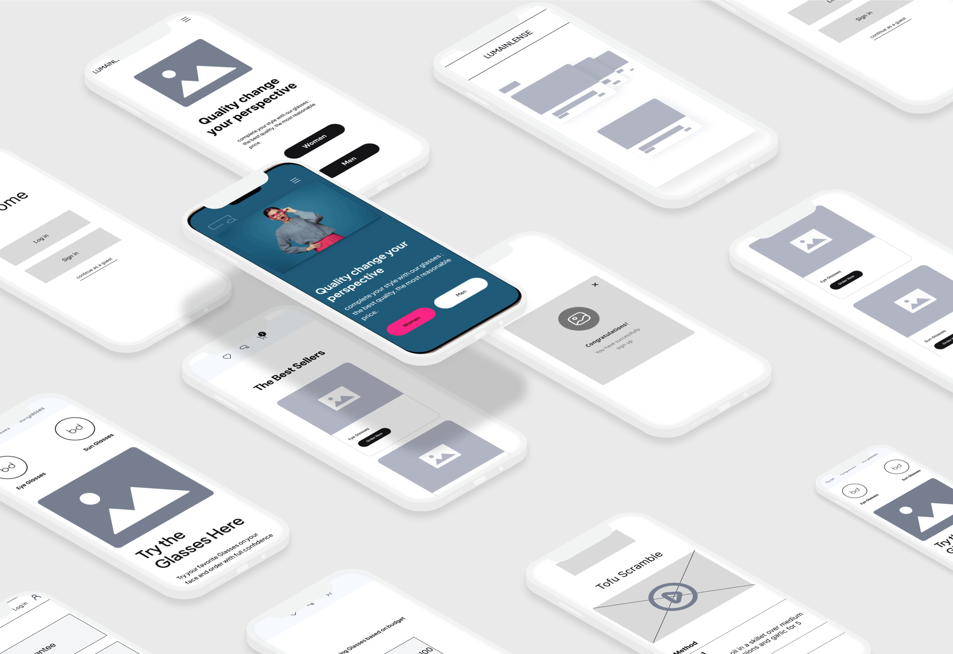
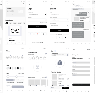
.Low-Fidelity Wireframes
In this phase, I created low-fidelity wireframes to establish the core structure and user flow of the website, focusing on functionality over design details. The key screens include:
Homepage: Prioritized product highlights and promotional banners for easy user engagement.
Product Categories: Organized by filters such as type, size, and price, allowing for seamless product browsing.
Checkout Flow: Simplified navigation for adding items to the cart, entering shipping information, and completing the purchase.
These wireframes ensured that the user’s journey would be intuitive, guiding them smoothly through product discovery to finalizing the purchase, without the distraction of complex visual elements.
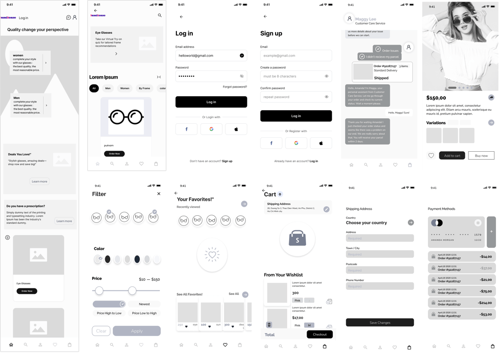
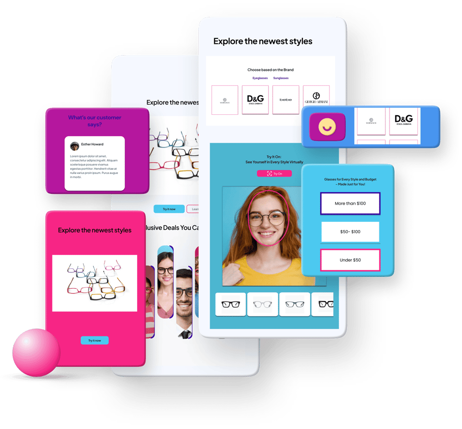
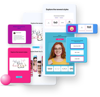
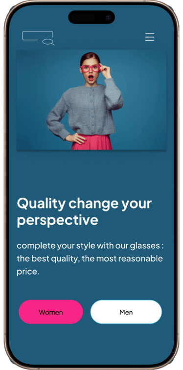
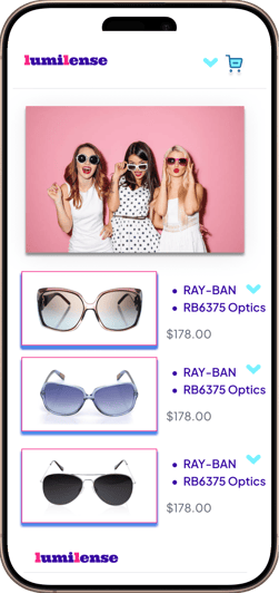
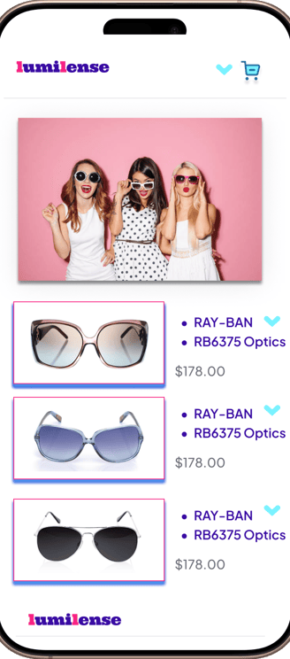
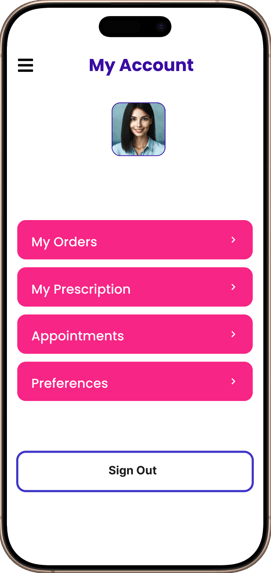
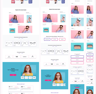
.Prototyping & High-Fidelity Mockups
After refining the wireframes, I transitioned to creating high-fidelity prototypes to visualize the final design and interactions. The prototypes showcase a polished visual design, with attention to layout, color schemes, typography, and branding. I integrated interactive elements such as hover states and smooth transitions, enhancing the user experience by providing intuitive feedback and ensuring seamless navigation.
Through feedback from the team, I made adjustments to optimize usability, resulting in a more engaging and user-friendly design. These refinements led to an interactive prototype that closely mirrors the final product, ensuring the user's journey is both functional and visually appealing.
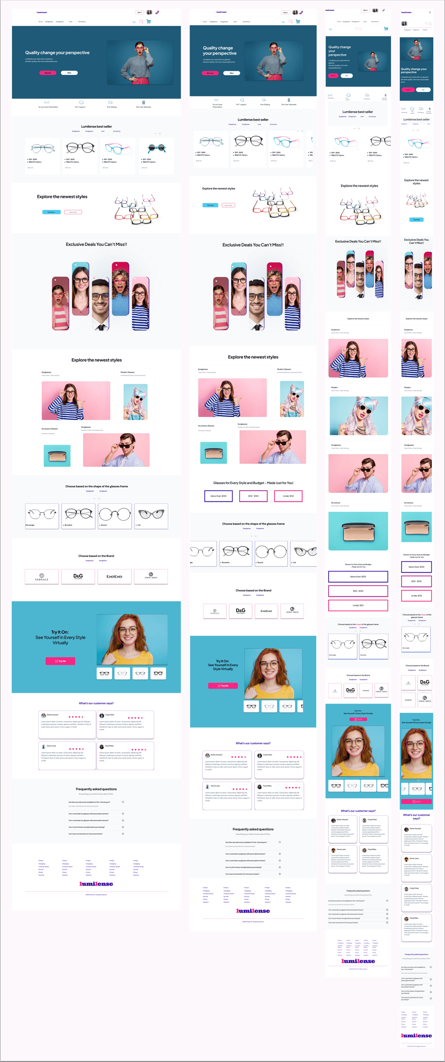
3. Visual Design
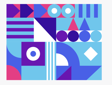
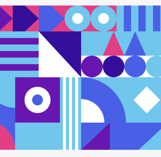
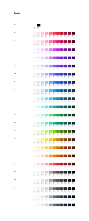
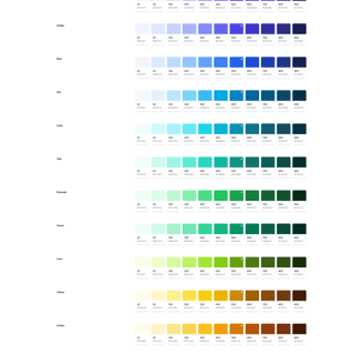
The color palette for the project was developed collaboratively, reflecting the conductor's preference for joyful and vibrant hues. Together, we selected a palette that balanced brightness and cohesion, ensuring the colors resonated with the brand's identity while maintaining visual harmony across the design. This collaborative process ensured that the final palette was both engaging and aligned with the project's goals.
Typography
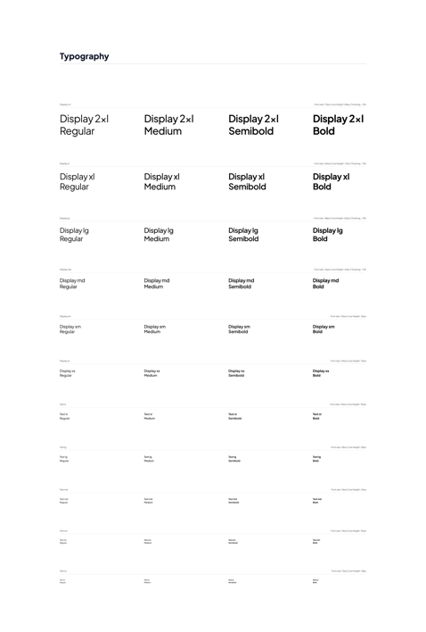
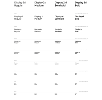
For typography, the Inter font was selected for its modern and clean appearance, ensuring excellent readability across digital platforms. Its versatility makes it suitable for both headings and body text, creating a consistent and polished visual hierarchy throughout the design. This choice complements the vibrant color palette, enhancing the overall user experience.
4. Collaboration with Developers
To ensure seamless collaboration with developers, I provided comprehensive style guides and detailed specifications for each page, outlining the visual and interactive elements. This facilitated a smooth implementation process and minimized potential discrepancies. Additionally, I maintained open communication, remaining accessible for troubleshooting and addressing design-related questions during development, ensuring the final product aligned with the design vision and user needs.
4. outcomes
The final design achieved remarkable results, featuring:
Responsive Design: Optimized for seamless performance across desktops and mobile devices.
Enhanced Usability: Clear navigation, visually striking CTAs, and a secure, streamlined checkout process.
Aesthetic Appeal: A sophisticated, cohesive interface that reinforced the brand’s premium image.
The project met the deadline and scope, with post-launch support addressing minor updates and further optimizations.
Client Feedback
Saman commended the project’s success, noting the smooth user experience and visually engaging design. Users praised the store for its intuitive navigation and fast product access.
Reflection
This project reinforced the value of collaboration and user-centered design. Transforming Saman’s vision into a thriving digital storefront demonstrated my adaptability and commitment to delivering high-quality results.